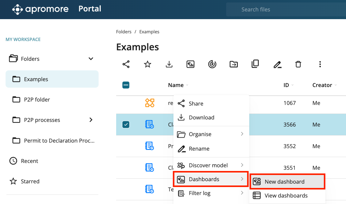
Add a chart widget
We can add charts to display various performance metrics in the process. We can create the following charts.
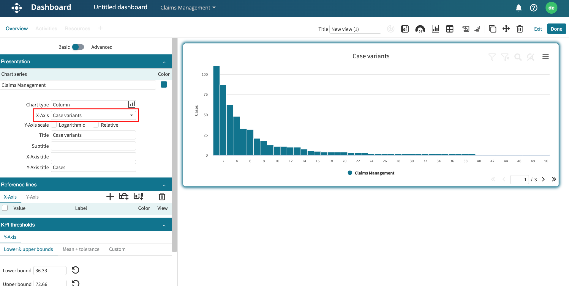
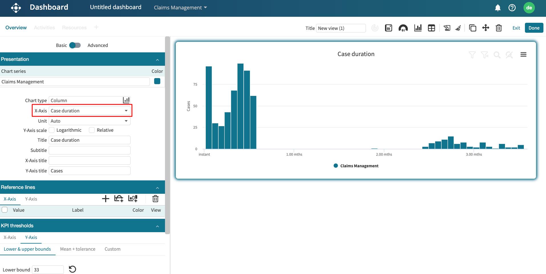
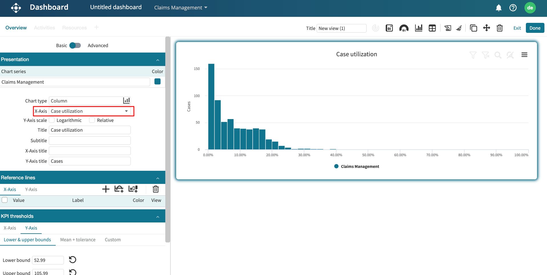
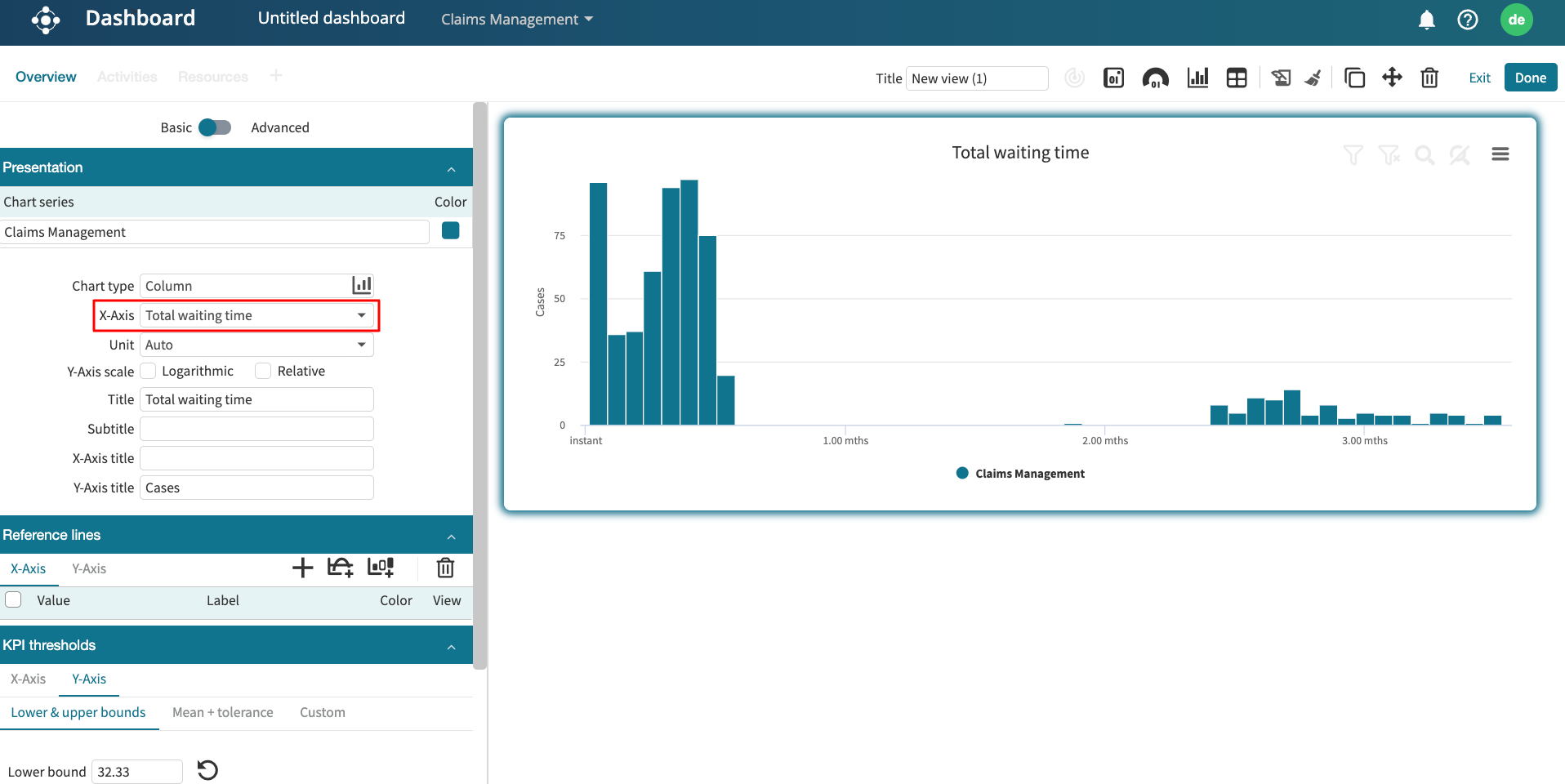
Case analysis chart: We can display the case variants, case lengths, case utilization, case duration, case processing time, and case waiting time charts.
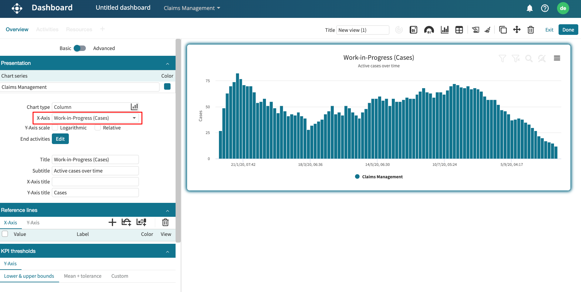
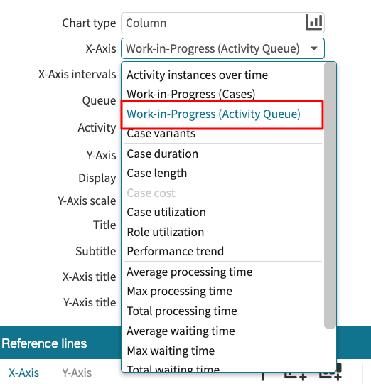
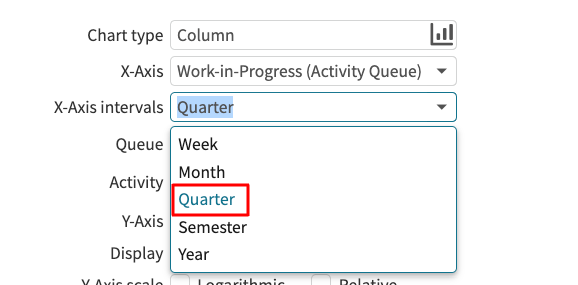
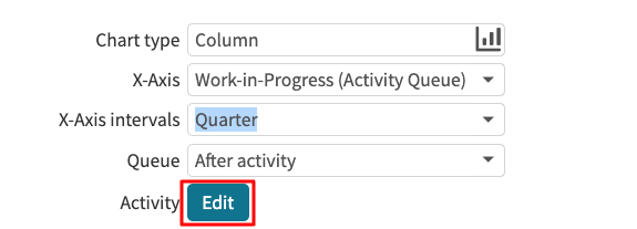
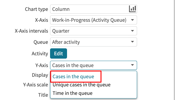
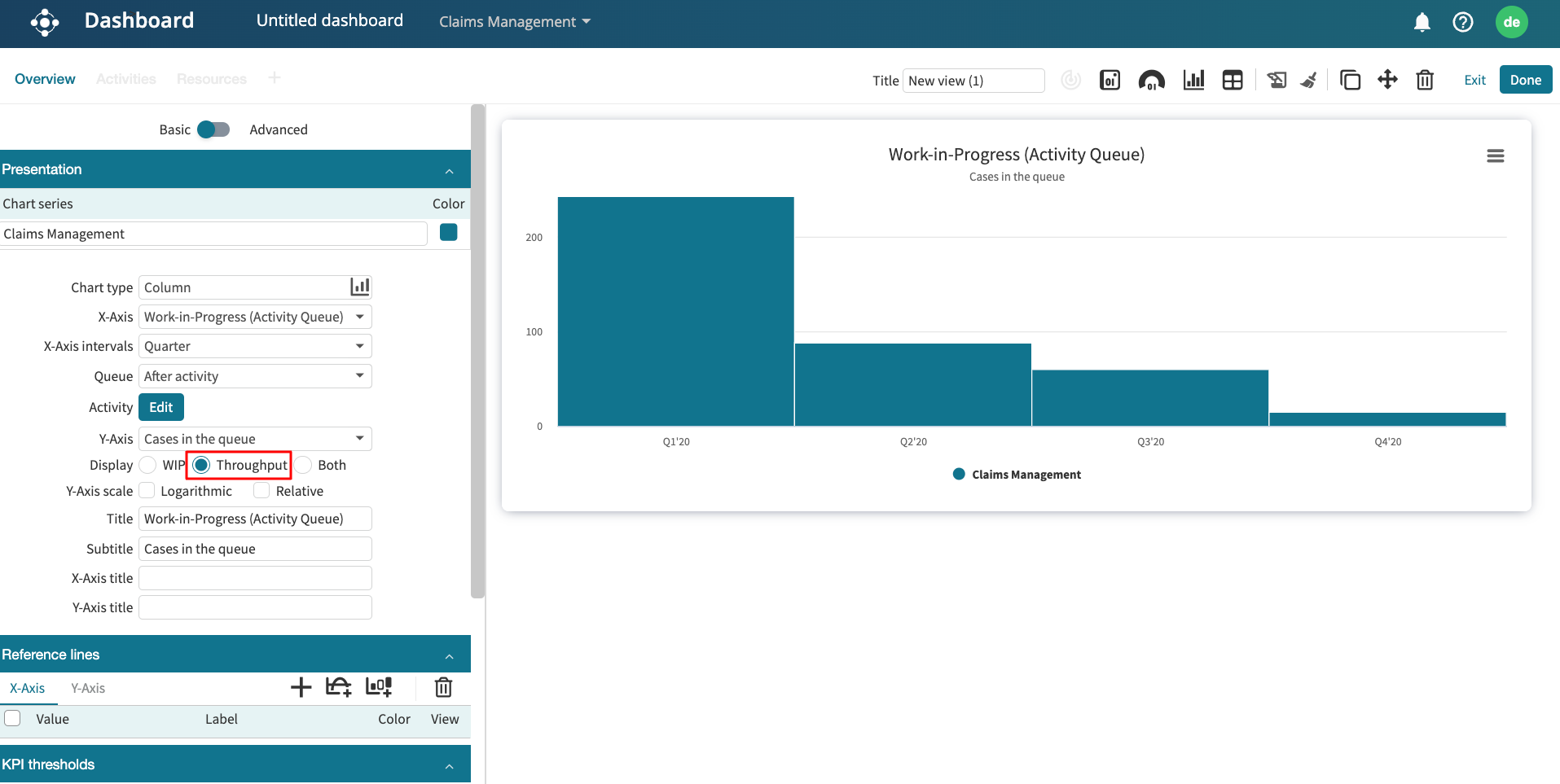
Work in progress chart: We can display the work in progress chart based on number of activity instances, number of active cases, number of cases in the queue and queuing time.
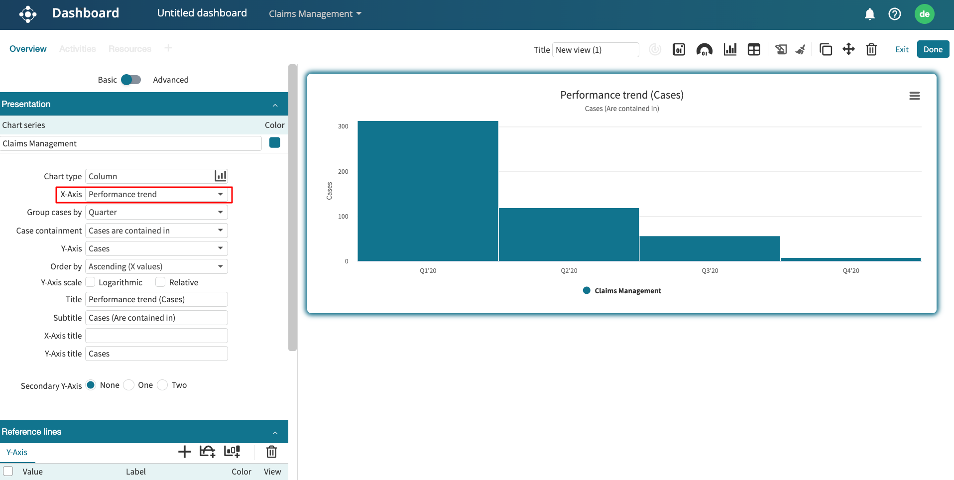
Other charts: We can display the case attribute chart, event attribute chart, and performance trend chart.
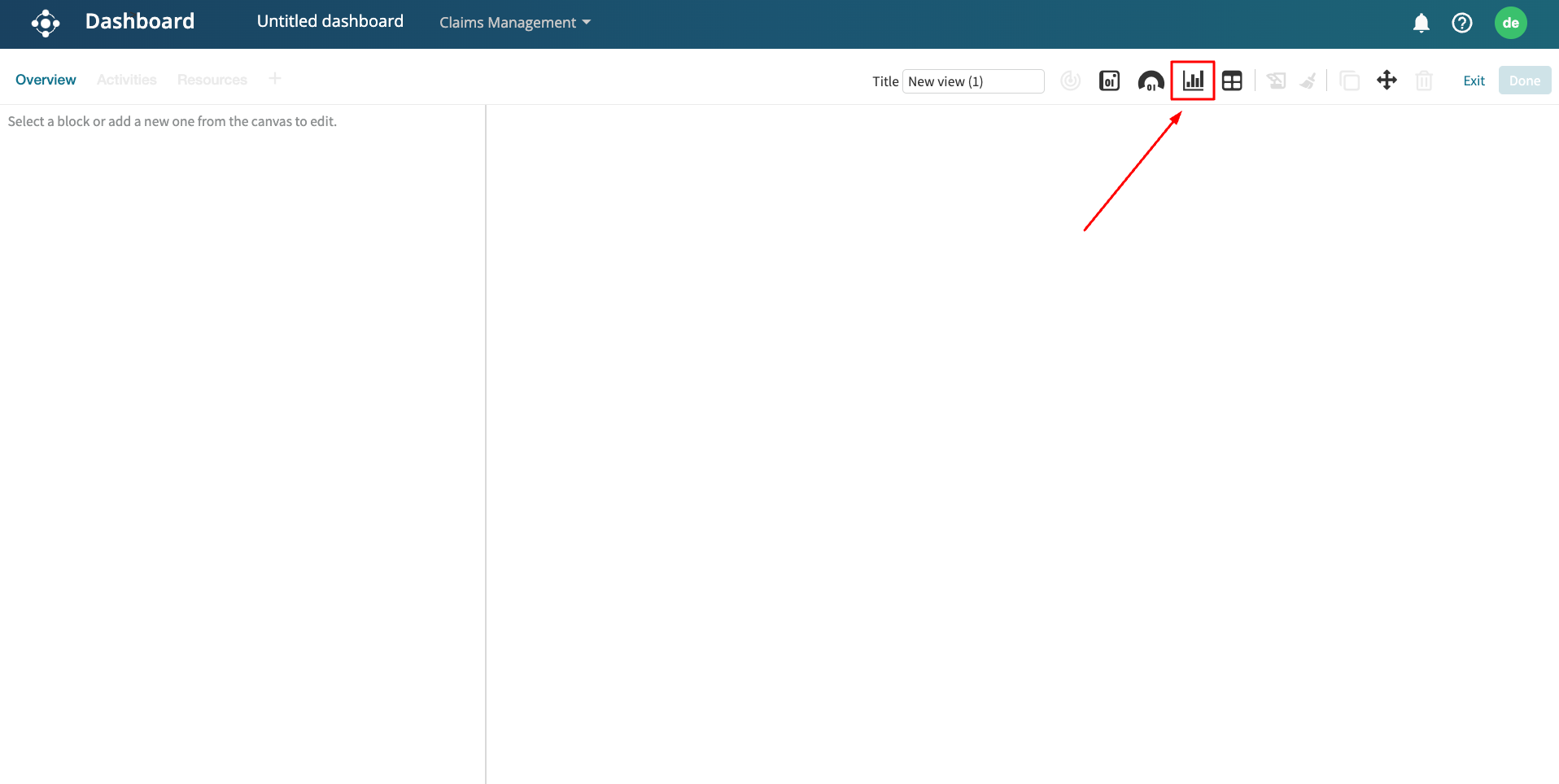
To create a chart as a widget, click Add widget > Chart.
Select the log.
This creates a performance trend chart as the default.
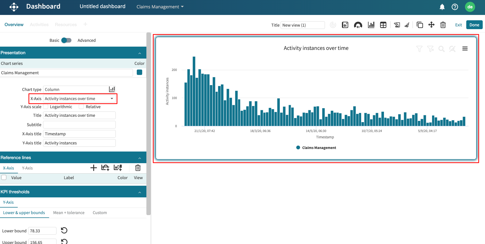
To change the chart type, click the Analysis type dropdown.
We can, for instance, display the case duration chart. Select Case analysis as the Analysis type.
Select the attribute to display its metric by clicking the X-Axis drop-down menu. For example, select Channel.
We can also specify the aggregation function to display on the Y-axis.
We can also scale the chart either using the logarithmic or relative scale.
We can also change the chart visualization chart. Let’s say we want to add a performance trend chart as a line chart. In the visualization type dropdown, click Line.
In the same vein, we can plot a spline chart.
Or an area chart.
Design a chart widget
We can customize the design of a chart. Specifically, we can add a border color, turn on data point labels, and turn on grid lines.
To customize a chart, go to Design.
We can display a border color by selecting the color of choice.
To see critical points in the chart, we can turn on data point labels. Toggle Datapoint labels.
Lastly, we can also turn on grid lines. Toggle on Grid.