Add a KPI or metric widget
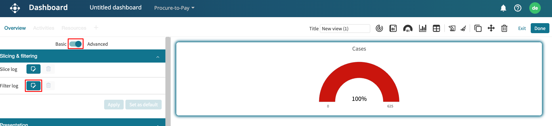
To enable us to get quick insights into existing KPIs and metrics in a process, we can create a widget on the lite dashboard that displays certain KPIs and metrics. This helps us quickly identify whether a KPI is breached or met over time. To add a KPI or metric, click Add widget > KPI/Metric.
Select the log where the KPI or metric was saved.
This creates a blank KPI/Metric widget where we can configure the specific data to display, select a data source, and customize its appearance.
KPIs and metrics on the dashboard are organized into two categories:
Unnamed KPIs/metrics: These are automatically computed by applying predefined statistical functions provided by Apromore to the log data. For instance, counting the number of cases in the log.
Named KPIs/metrics: These are explicitly defined in the KPIs & Metrics Center, allowing us to fetch and display their values directly on the dashboard.
To add a KPI or metric to display, select a KPI or metric from the KPI/Metric dropdown.
To display an unnamed KPI or metric, we can select the following:
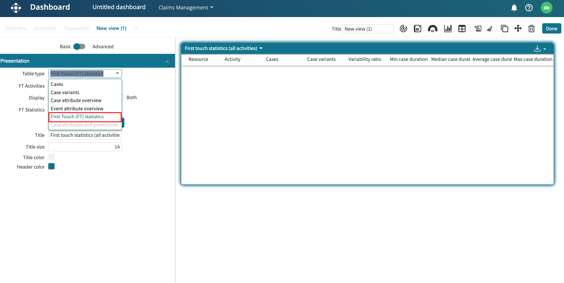
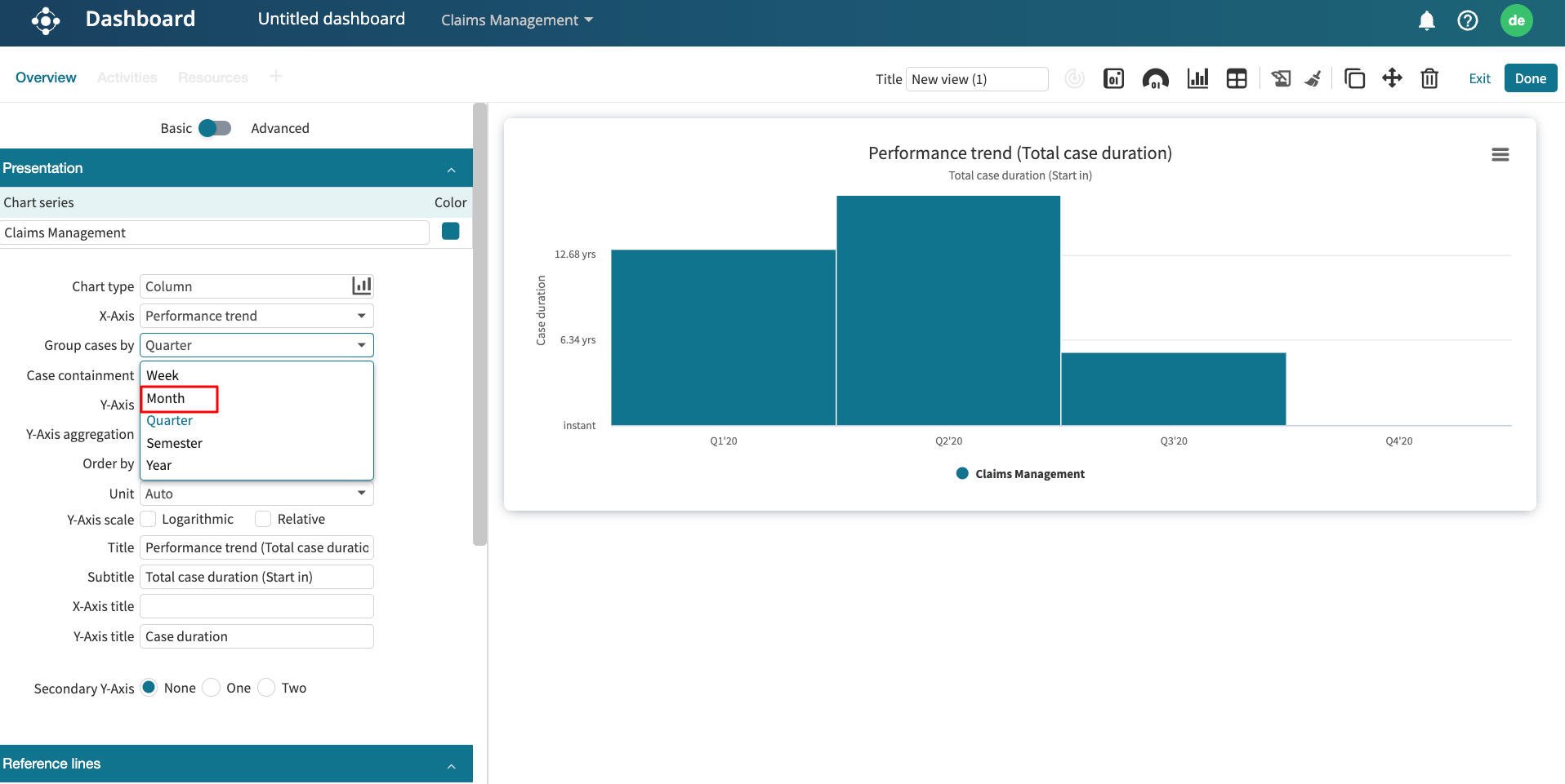
Log statistics: To display the activity instances, cases, case variants, variability ratio, and log timeframe.
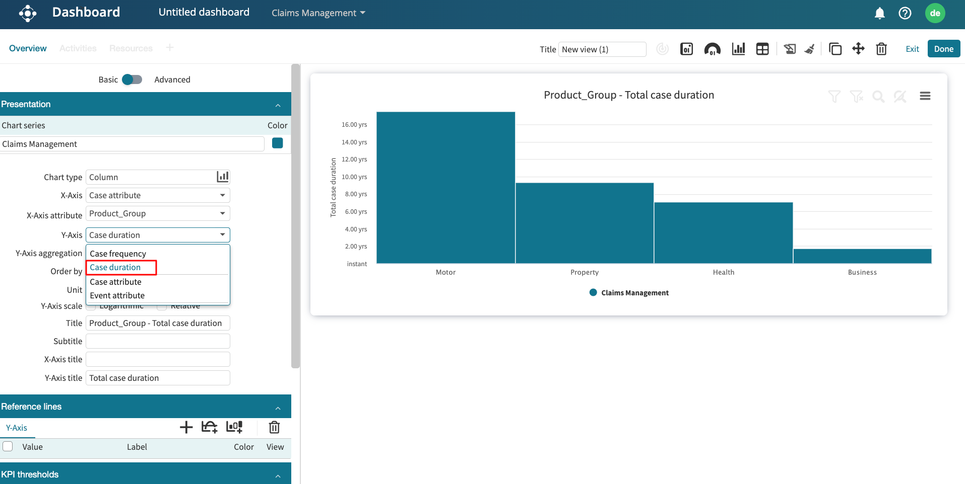
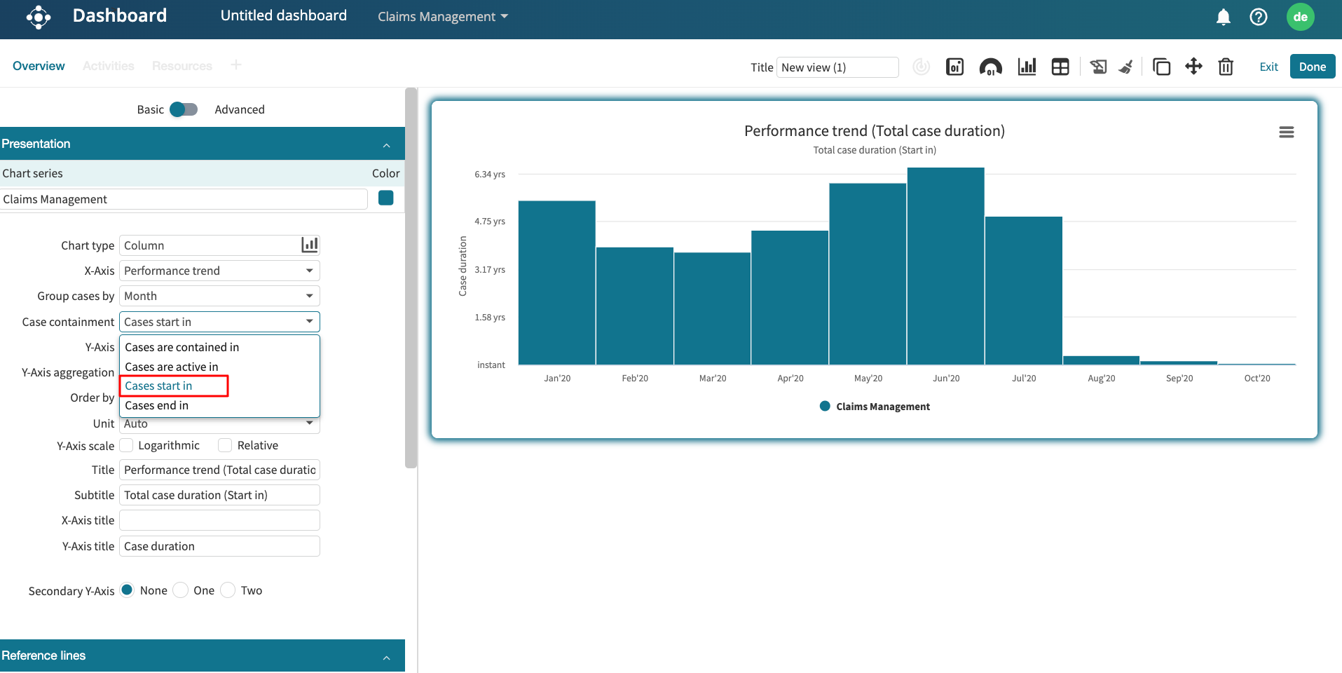
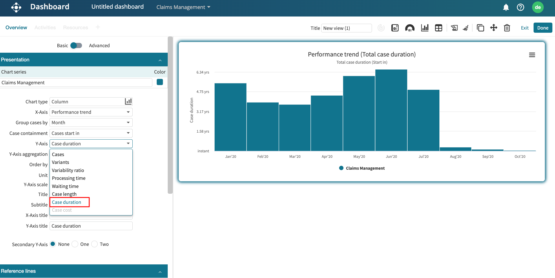
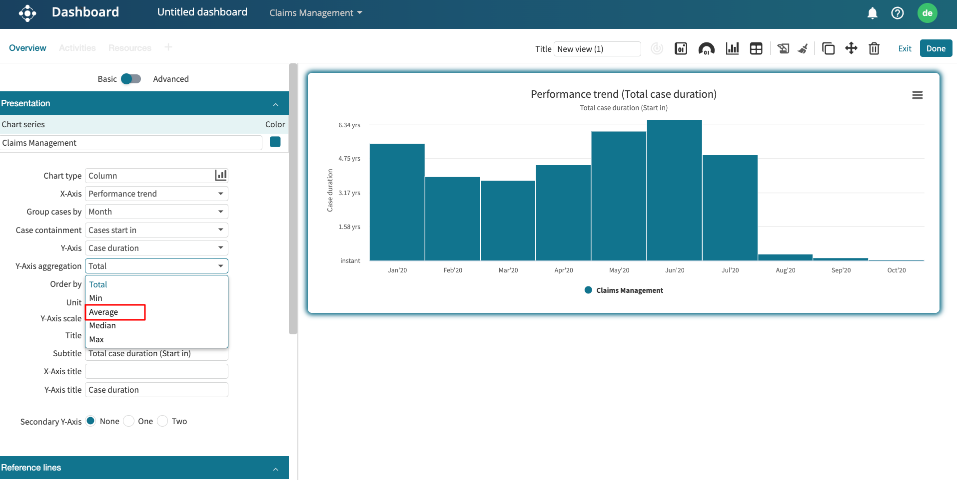
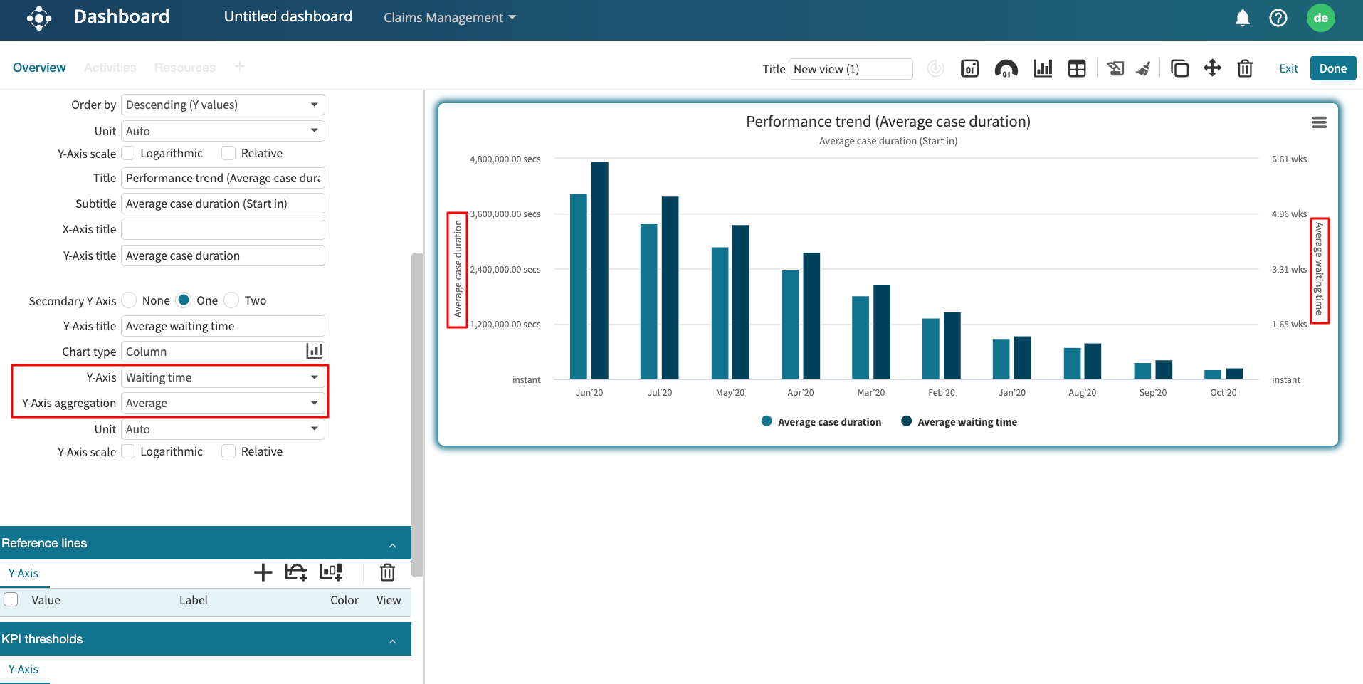
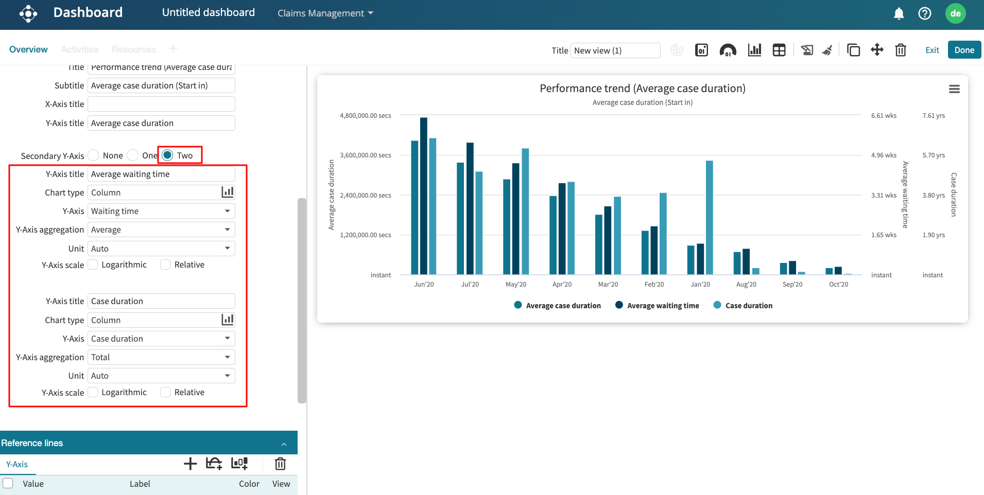
Case metrics: To display the case length, case duration, case cost, case rework, case utilization, case processing time, and case waiting time.
Handover (arc) metrics: To display the handover performance between activities, resources, or roles. Handover performance that can be displayed are frequency, duration, and rework.
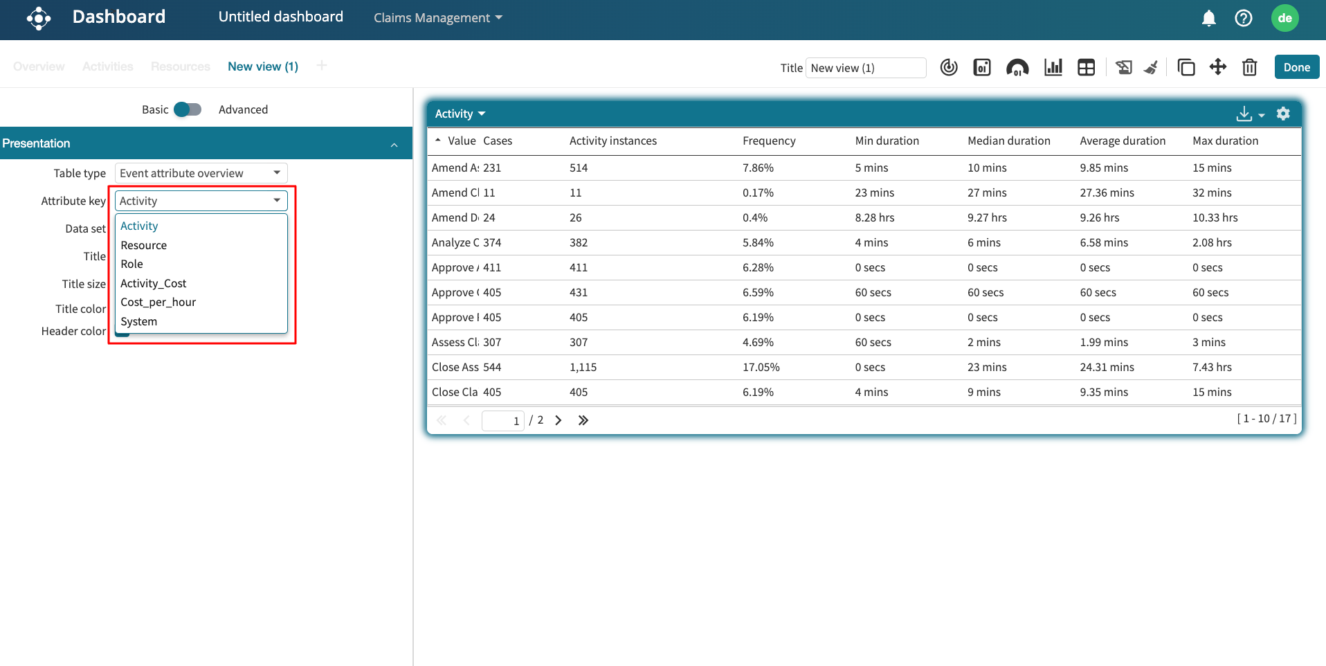
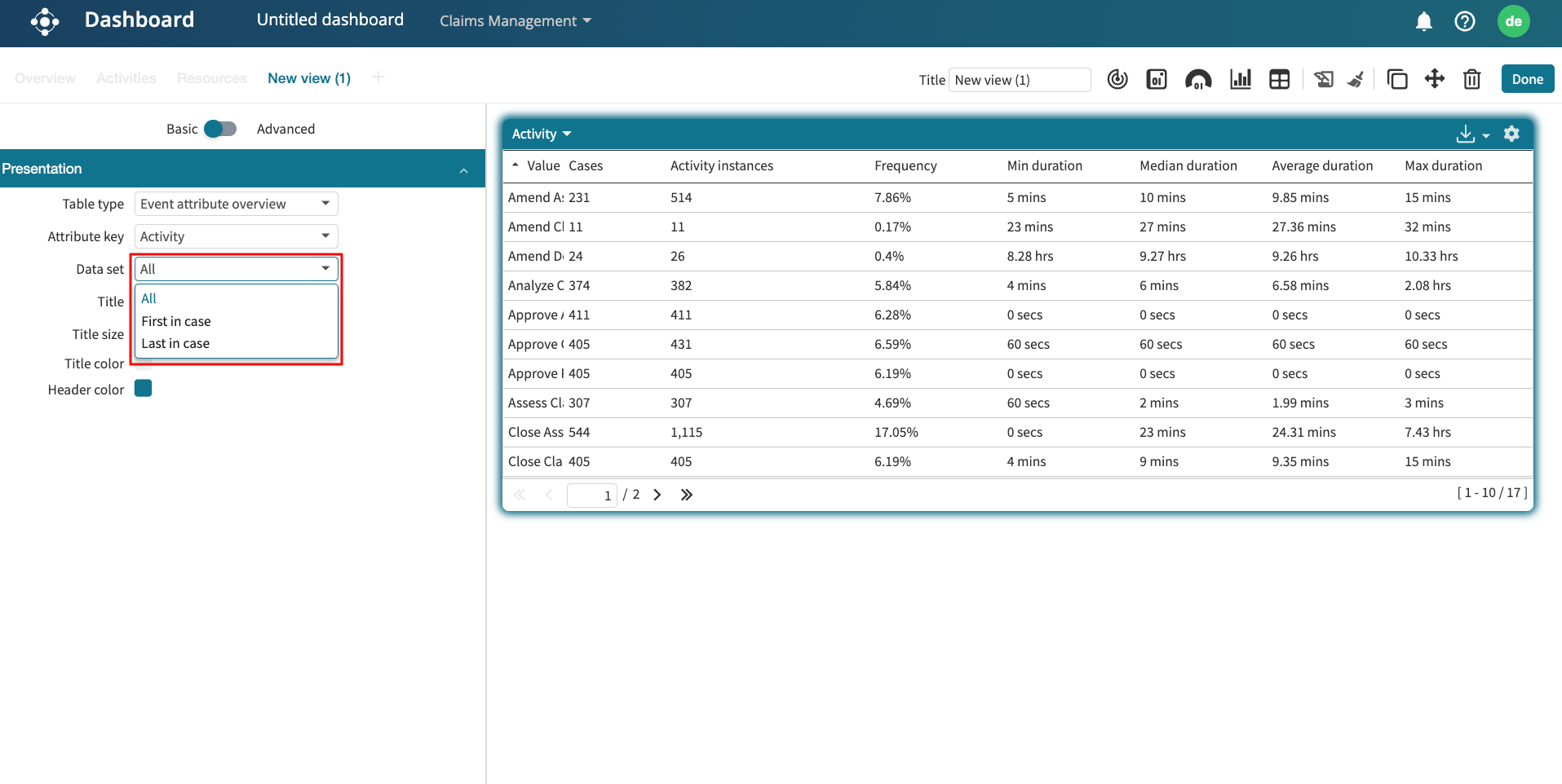
Event attribute: To display the frequency, duration, rework, and cost of event attributes in the log.
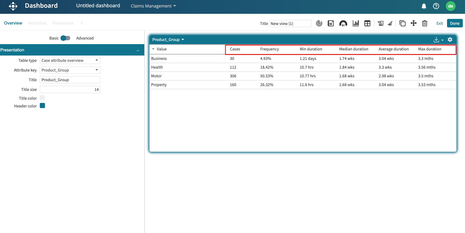
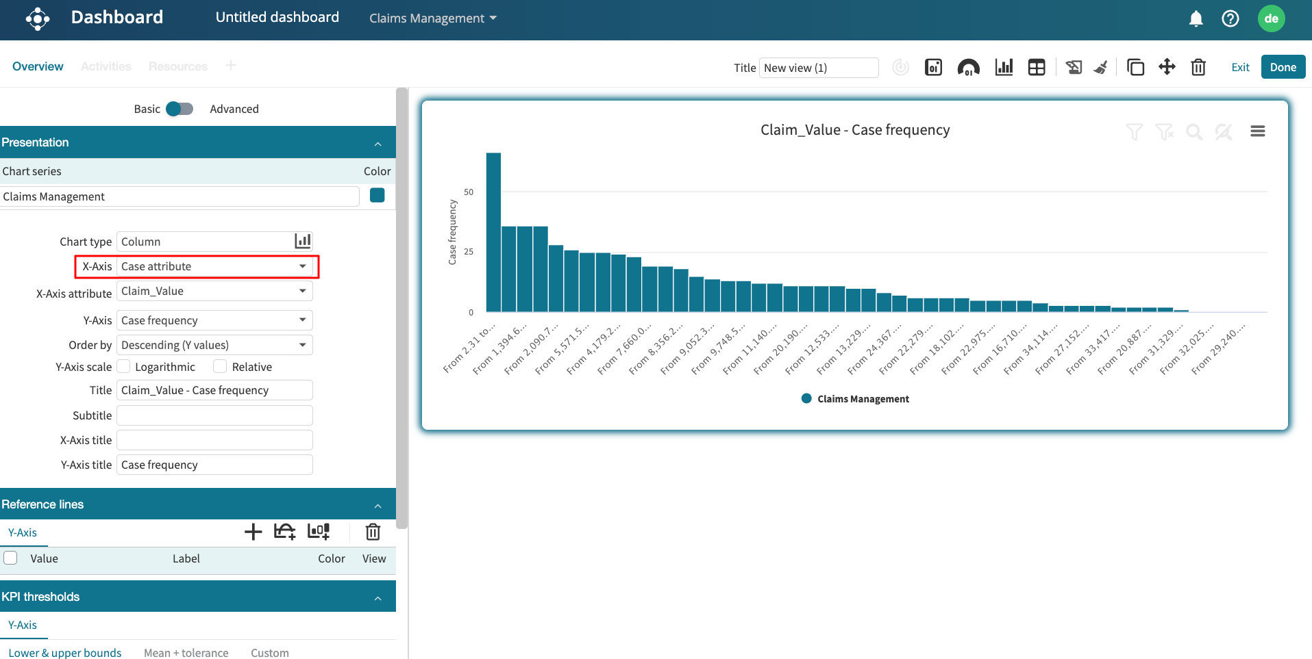
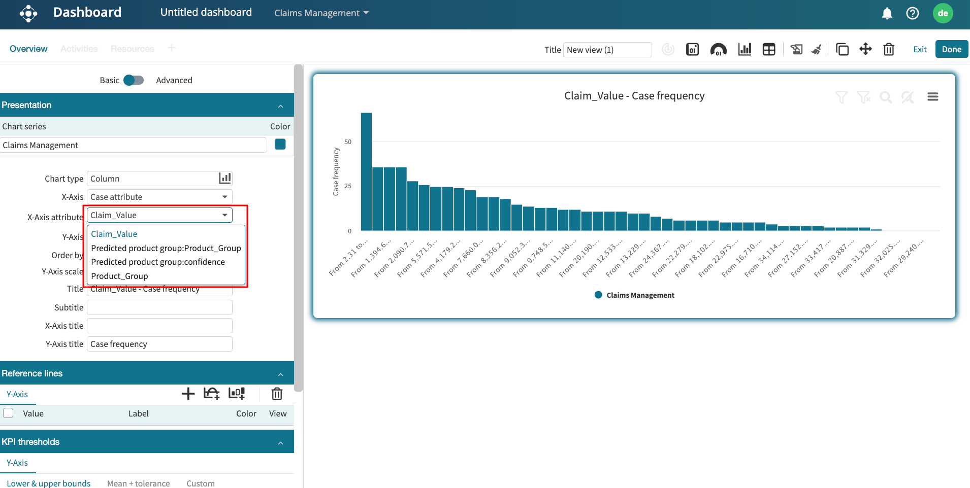
Case attribute: To display the frequency and unique values of case attributes in the log.
To select a named KPI, however, select KPIs and metrics from the list of options.
Note
Lite dashboards allow us to create widgets from different logs.
Imagine we wish to display the following KPI and metrics on the dashboard from the claims management log:
Number of cases.
On-time delivery KPI.
Resource utilization KPI.
And the following from the loan origination log:
Log timeframe in the loan origination log.
Number of activity instances in the log.
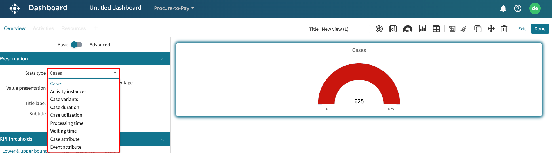
To display the number of cases metric, select Log statistics in the KPI/Metric dropdown.
In the drop-down below, select Cases.
This displays the metric value.
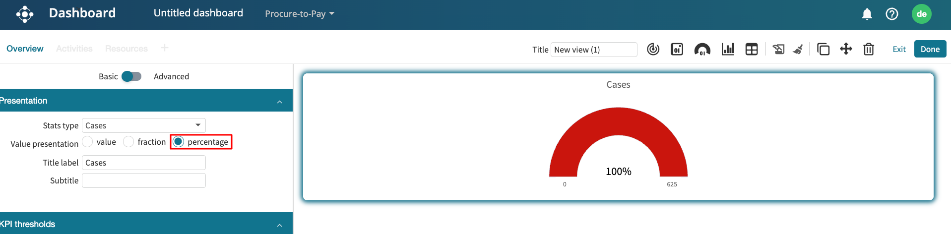
If the metric is not a whole number, we can specify whether to display a fraction or a percentage.
We can display a title or subtitle for the metric. Simply check the title and subtitle boxes.
The title and subtitle are automatically prefilled based on the data displayed but can be changed to any other text.
One benefit of Lite Dashboards is that we can create widgets from different logs. Let’s say we want to display the log timeframe for the loan origination log. To add a new widget, click Add widget.
Select the kind of widget. Select KPI/Metric.
Select the data for the widget. This time, we select “Loan Origination”. Click Select.
The new blank widget is displayed.
We can drag and drop a widget to dynamically change its position.
In the KPI/Metric dropdown, click Log statistics and select Log timeframe in the sub drop-down.
We can add other metrics. Let us add the activity instances in the loan origination log.
Now, let’s add named metrics and KPIs. A KPI called “On-time delivery” has been created in the KPI and metric center.
To display this KPI in the lite dashboard, create a new widget. In the KPI/Metric dropdown, select KPIs and metrics.
We can either select a KPI or a metric. In this case, let’s select KPIs.
In the sub-drop-down, Apromore lists all saved KPIs for the selected log. Select the On-time delivery KPI.
We can also display a named metric. Select Metrics and the metric of interest.
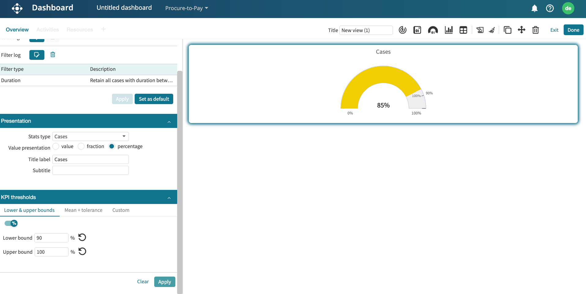
If a process-level KPI has been created from this metric, we can rather display the KPI and see whether or not the KPI is fulfilled.
We see that because the target is set to <35, a value of 30.4 meets the KPI.
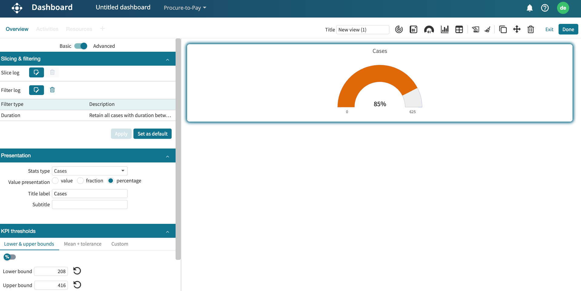
Design a KPI or metric widget
We can design a KPI/metric widget. To do that, go to the Design tab.

We can add border colors from the default colors or by entering a hex color code.
We can also change the font size of the data. In the Font drop-down, select Small, Medium, or Large.
We can change the text alignment to the center, justified to the left or right.
We can also define the number of decimal points to be displayed, up to 3 decimal points. Enter a value between 0 to 3 in Decimal digits.
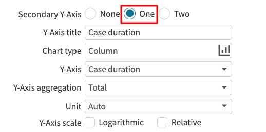
For case-level KPIs, we can change the visualization type to display a chart.
We can also change the type of chart.